UX Designer
Goodreads is a social cataloging site dedicated to helping people to find new books to read, share reviews, and connect with other readers. It is the world’s largest platform to find and share books. However, the existing application is no longer meeting user needs due to its outdated design aesthetic, unintuitive use, and lack of efficiency in social networking for users.
Goal:
Revitalize the Goodreads interface to visually please users and create a more intuitive user experience.
Business Analysis:
Prior to designing the interface, I wanted to understand how Goodreads generates revenue. Goodreads was founded in 2007 and acquired by Amazon in 2013. The analysis of publicly available information indicated that the platform primarily generates revenue through (1) running ads (2) referral fees on book sales when bought through Amazon, Barnes and Noble, and Kobo.
Basically any site updates that cause users to spend more time on the site lead to more ad revenue and book sales, which would benefit this Goodreads redesign.
Research:
To gain a holistic view on Goodreads, I conducted 15 Zoom video interviews with Goodreads users that interact with the site at least five times a week, Goodreads users that use the site once a month, and nonuser book readers. I want to understand what existing users love about Goodreads and how that affects the frequency of their site interactions. I was also interested in why nonusers don’t use the platform and what factors they may find engaging.
Interview Insights
PAIN POINTS:
- While the Friends and Groups features hold a lot of potential, users find it difficult to connect with individuals reading the same book or with similar book interests on Goodreads. However, when users had friends on the site, Goodreads became more appealing because there was more social interactions
- Outdated design
- Star ratings can be misleading
- 45% of Goodreads users find the site easy to use
- Users found the mobile app to be frustrating especially accessing My Books on My Profile because there are too many avenues users can take to access the same page
- 75% of users found a lack of direction and incentive other than setting the yearly reading goal
- Most users preferred using the mobile app versus the website because of ease of access, although there are more features on the website
USER NEEDS:
- Attractive, modern, and interactive interfaces
- More incentives to read other than the annual reading goal
- Organize Goodreads website homepage (described as unorganized)
Summary
- Goodreads’ current library of information is unintuitive to navigate
- Users enjoy the social aspect of the site, but find it hard to engage with
- The main attraction of Goodreads is to log books read and to-read
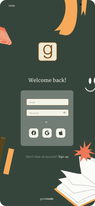
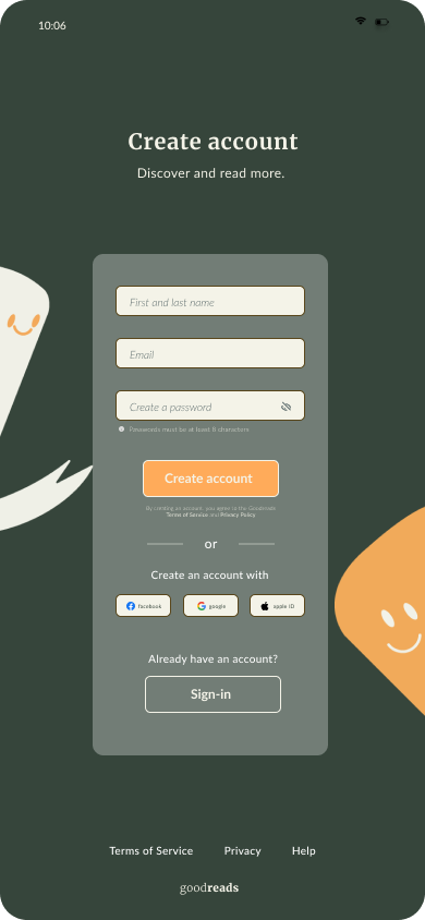
- The sign-up and welcome to the site needs better narrative to explain the app to users
Design
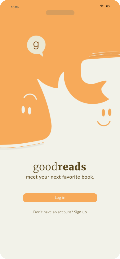
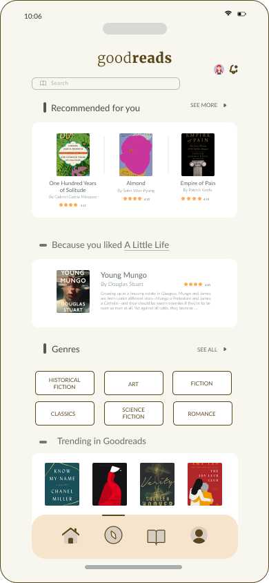
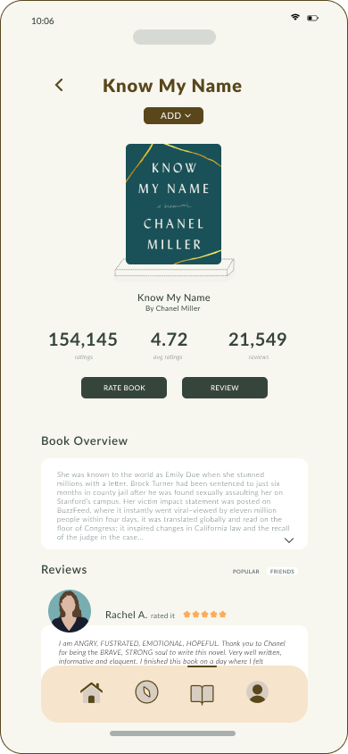
I decided to create a modern application for Goodreads that both honors the existing visual identity and integrates a personalized, fun interface. I created a Goodreads character, which is meant to resemble an everchanging literary presence, noted by the lines indicating book pages and appendages representing bookmarks. I intended the character to be bright and inclusive, inviting users to interact with the platform.
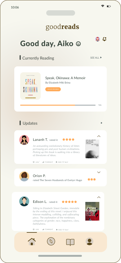
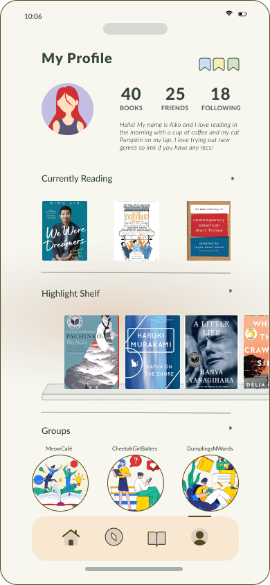
To increase ease of engagement between users, I redesigned the Home page to prioritize the activity of friends and followed users. I added a feature to connect users to one another based on location, current books reading, and book genres enjoyed. I want the features of adding friends and joining groups to be a frictionless experience
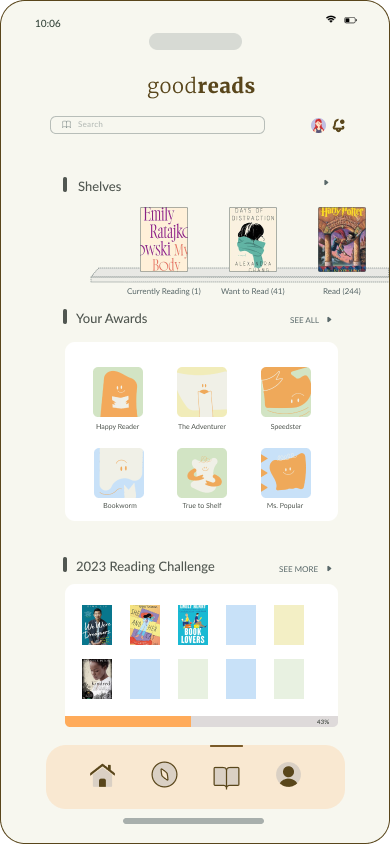
To address the lack of incentives for readers, I added an Awards System to engage readers on milestones other than the annual reading challenge. Awards are to be given to readers when they reach smaller goals such as books reviewed, new genres ventured into, pages logged, friends made, etc. We want readers to feel satisfied and rewarded for reading and using the site.
